Ecommerce Website Navigation Best Practice
Most Ecommerce Is Done On Mobile Devices
There are many experts writing on Ecommerce Website Navigation Best Practice. But most of those writings ignore the fact that most ecommerce is conducted over mobile devices, not big screen computers. You should be spending at least as much time designing the navigation for mobile devices as for bigger screens. Simply depending on the site's responsive defaults is not good enough because you are likely to be throwing too many options on a single screen.
The principles of good navigation practices for ecommerce websites is the same for any screen size. Keep it clear, simple and minimise the number of clicks needed to view and purchase a product. But the way these are implemented on different platforms differ.
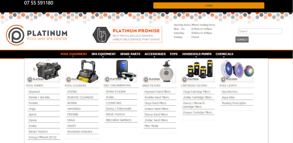
On a desktop or laptop computer you can have a "mega menu" with multiple columns of links to minimise how many times a visitor has to click a mouse button to get to the product. That of course doesn't work on a mobile phone where you simply can't display the same number of items on a screen. If you have a site with a small number of products this is not such a challenge but for sites with hundreds or thousands of products you need to be focused on "what does the site visitor want to see". The most popular product collections should be the most visible but less popular products need to be easy enough to find so that the visitor doesn't give up in frustration and go to competitors site.
Navigating With Buttons and Icons
You should have your products divided into categories or collections and links to those collections appear in the main menu with dropdowns to nested collections. But on the home page you should have buttons, icons or images that link directly to the most popular collections so your site vistor doesn't have to drill down through multiple dropdown menus. This is good practice on all screens but vitally important on small screens such as mobile phones. Choose images and icons carefully though. They are there to guide the site visitor so they need to be instantly recognisable for what they represent. They also need to be big enough and spaced out enough for chubby fingers to select without hitting two other buttons in the process.
Image sliders
Another way to include more links on a small screen is to have a sliding image banner on the home page with an image and link to each of the most popular collections. The advantage of image sliders is that the visitor doesn't have to scroll down. They can just wait for the product collection to be offered to them. They also give you the opportunity to highlight special offers and newly introduced products. The downside of sliders is that some popular image sliders are very damaging to the site loading speed so make sure your site is speed tested on gtmetix.com with and without the slider to ensure the one being used is not damaging the site performance.
Search and Filters
Search boxes and filters allow visitors to type in what they want rather than having to search through the menu layers. This is very important for sites with large numbers of less popular or less commonly purchased products such as spare parts. If you sell pool products for example, Pool Filters may be one of your key product collections. Pool Filters wuld be a top level menu item and you would likely have a link directly from the home page to that collection page because a lot of site visitors want yto go straight to those products. You would not give the same prominence on your site to items like a rarely purchased replacement gasket for a superceded pool filter even though offering that product is key to your customer service committment. Having a search function on the home page makes that product much more accessible without wasting valuable screen space.
Most Popular Products
Having a "Most Popular Products" or "Related Products" banner or slider is also a good way to promote and provide quick navigation to specific products that may be of interest to your visitor. These banners can be on any or all pages. Upsells are similar and are usually displayed on the checkout page.
One Page Checkout
Just like finding products in your ecommerce website, the checkout process should also be as simple as possible. That doesn't necessarily mean a One Page checkout. One page checkout pages have been promoted as the ultimate for ecommerce sites but reducing the checkout steps doesn't always succeed in simplifying the checkout process for the first time customer. Having three steps that ask for one piece of information each (registration, shipping address, choice of payment processor) is often a more simple process than hitting the customer with all of your questions at once. There is still a push from many website designers for one page checkouts but in our experience they rarely achieve the goal of reducing abandoned carts.
And The Rest
Don't forget the other pages on your site. It doesn't matter how easy it is to find products if a potential customer can't find the shipping information they want or the contact form.
Once you think you have the mobile navigation mastered, get a friend to test it out. This should not be a friend with a qualification in website design becaus ethey are not your typical site visitor. The more technologically challenged your usability tester is, the likely you are to find issues that will trouble future site visitors.


